



For creators, marketers, and designers alike, selecting a colour story is both an art and a science. Here is a look at how the human eye and mind respond to the spectrum, and how to intentionally apply these hues to your work.
🟥 Red: The Catalyst
The Mood: Sexy, dynamic, stimulating, exciting, provocative.
The Science & Psychology: Red is the ultimate high-arousal colour. When the human eye processes red, it triggers the release of epinephrine (adrenaline), altering body chemistry to increase heart rate and energy levels. It is inherently aggressive, commanding attention and demanding action.
The Market Application: At the point of purchase, red is virtually impossible to ignore, making it a powerful tool for impulse buys and bold branding.
The Designer’s Nuance: When deepened into rich wine and burgundy tones, red loses its raw aggression but retains its magnetic allure. Consumers view these deeper shades as mature, authoritative, opulent, and refined—making them an exceptional choice for luxury, high-investment products.
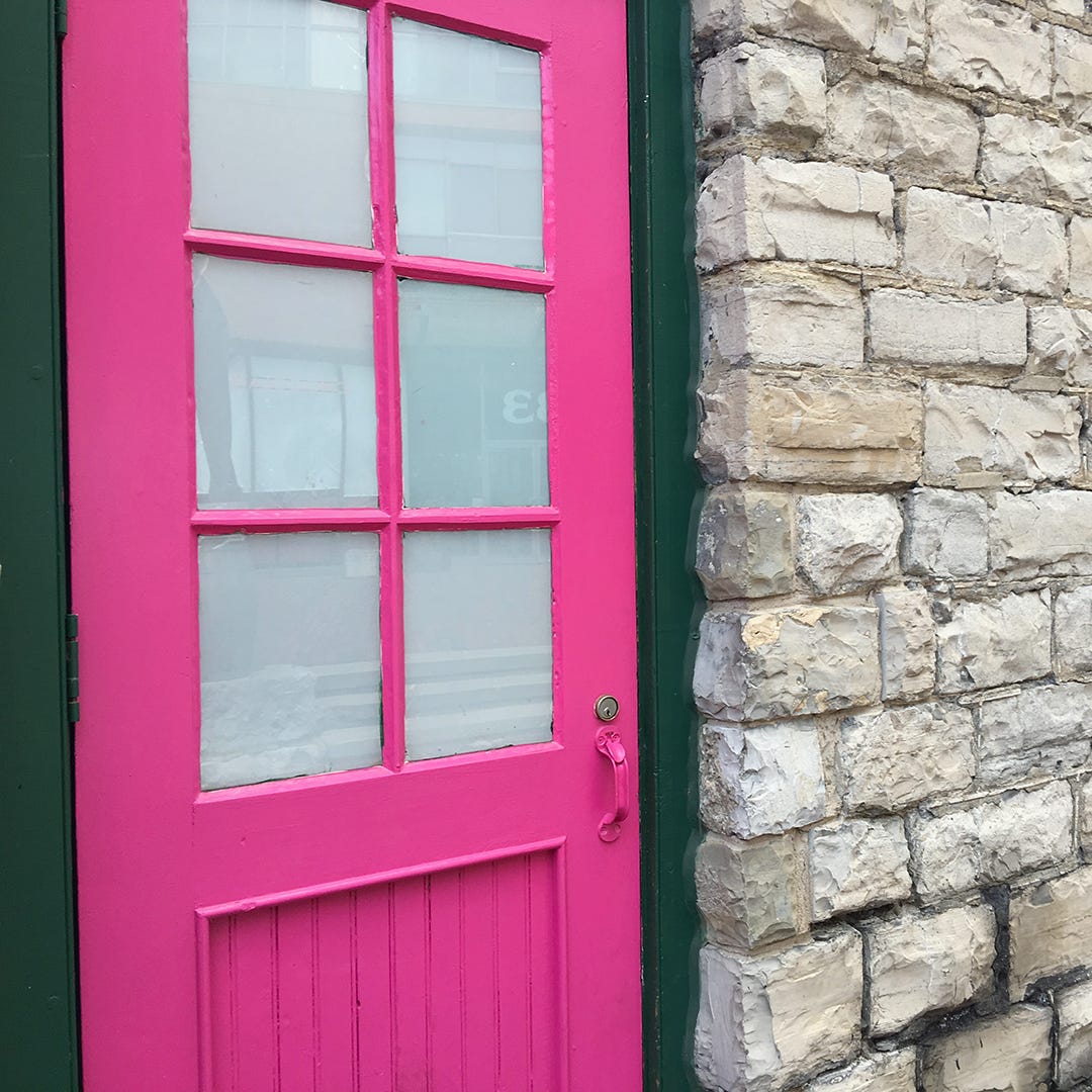
🟪 Pink: The Chameleon
The Mood: Romantic, youthful, happy, sweet, spirited.
The Science & Psychology: Pink inherits the high-energy pulse of its primary red roots, but its psychological impact shifts dramatically with intensity. Vivid, saturated pinks evoke a sense of wild abandon, playfulness, and youthful movement.
The Market Application: High-intensity magentas and fuchsias lean toward the theatrical and sensual, making them a staple in the beauty and cosmetics industries to create a sultry, upscale look. Conversely, soft, diluted pinks lose their raw sensuality, transforming into calming, romantic, and feminine tones.
The Designer’s Nuance: Paler pinks add a healthy, glowing reflection to skin tones. This makes soft pink an excellent choice for healthcare branding, skincare lines, wellness spaces, and spas.

🟧 Orange: The Vitalist
The Mood: Energizing, tangy, vital, friendly, inviting.
The Science & Psychology: Evoking the radiant warmth of glowing sunsets and autumn leaves, orange is arguably the hottest colour on the spectrum. It is inherently playful and social, radiating a friendly, welcoming energy.
The Market Application: Because it can lean into a whimsical, almost cartoonish impression, pure orange is brilliant for toys, games, and youth-centric products, but should be avoided when delivering a sombre message. Notably, orange has a measurable, physiological effect on the appetite, naturally linking the mind to the sweet, juicy tang of citrus. This makes it a premier choice for food packaging, restaurants, and dining spaces.
The Designer’s Nuance: Lighter, muted shades of orange such as peach, apricot, coral, and melon appeal to a highly sophisticated, upscale market. Much like pink, peach casts a healthy glow on the skin, making it a standout option for premium beauty and wellness environments.

🟨 Yellow: The Illuminator
The Mood: Cheerful, luminous, sunny, enlightening, warm.
The Science & Psychology: True to its solar nature, yellow radiates pure light and optimism. While other colours deepen as they become saturated, yellow simply becomes brighter. This makes it highly reflective and the single fastest colour processed by the human eye.
The Market Application: Because it catches the eye before any other hue, yellow is the ideal choice for point-of-purchase displays and signage. When paired with black, it creates a high-contrast, high-visibility signal that mirrors the natural warning signs of the wild (such as stinging insects), prompting consumers to stop and take notice.
The Designer’s Nuance: Warm, creamy, or sun-baked tones are universally comforting, especially in food spaces where they mimic the natural hues of butter, lemons, and custards. However, designers must exercise caution with green-based yellows; as yellow drifts toward green, it evokes a sharp, acidic, and tart taste profile (think Granny Smith apples), which can read as unappealing outside of specific, trendy contexts.
🟫 Brown: The Anchor
The Mood: Rustic, rich, sheltering, durable, earthy.
The Science & Psychology: Rooted firmly in the natural world, brown represents substance, stability, hearth, and home. Tones like terracotta, clay, brick, and tan offer a psychological sense of safety and secure shelter, echoing a deeply ingrained human need for protection.
The Market Application: In the culinary world, brown translates seamlessly to two categories: rustic health (brown rice, whole grains, artisanal breads) and decadent luxury (rich chocolate and fine coffee).
The Designer’s Nuance: Once overlooked in fashion and interiors, brown has earned immense respect as a sophisticated neutral. A brown-anchored interior envelops a space in rich, quiet luxury, style, and enduring comfort.
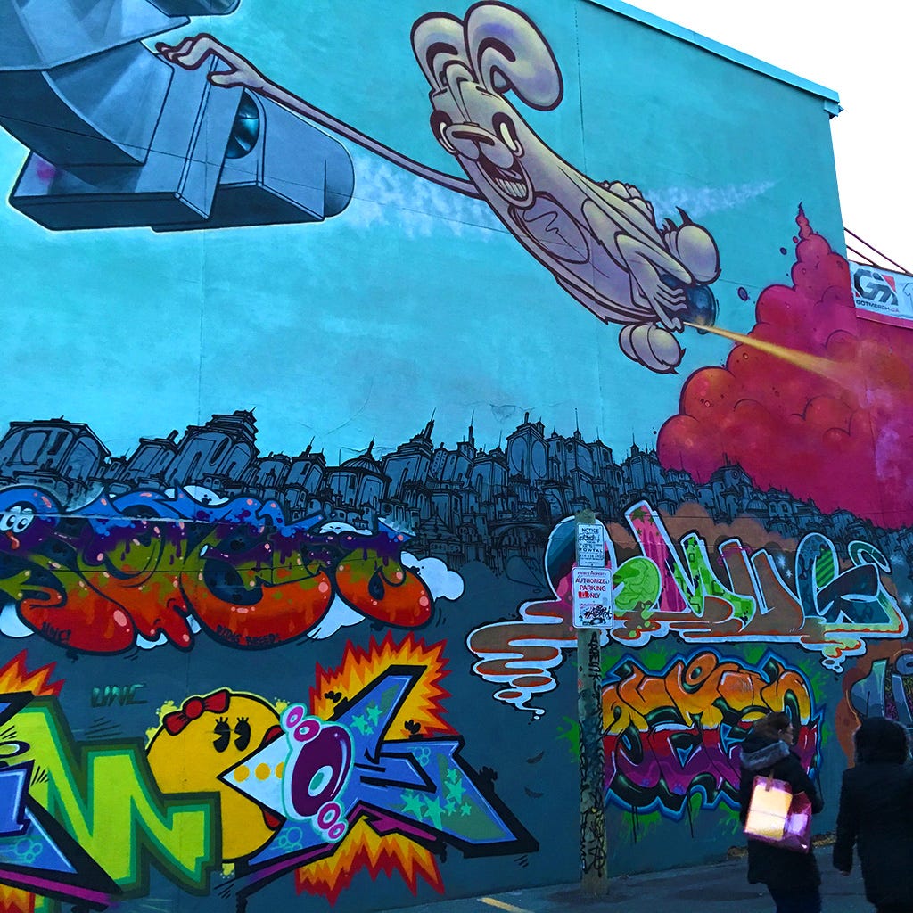
🟦 Blue: The Constant
The Mood: Cool, serene, dependable, quiet, constant.
The Science & Psychology: Tied directly to the vastness of the sky and the stability of the ocean, blue inspires immediate trust, commitment, and confidence. It is a profoundly restful colour. When we perceive blue, the brain releases chemical signals that act as natural tranquillizers, slowing the pulse and inducing a state of calm.
The Market Application: Corporate giants, banks, and financial institutions rely heavily on blue to convey unshakeable reliability and fiscal safety. In medical settings, soft blues are used on walls and scrubs to keep patients and practitioners grounded.
The Designer’s Nuance: Darkening blue into navy instantly infuses it with authority, credibility, and power—offering a friendlier, more approachable alternative to the severity of black. On the flip side, brilliant electric blues introduce high drama, periwinkles add a playful red-undertone energy, and rich teals cross gender lines effortlessly to project a unique, upscale aesthetic.

🟩 Green: The Living Neutral
The Mood: Natural, refreshing, healing, soothing, lush.
The Science & Psychology: Green offers the widest, most versatile array of choices in the entire colour spectrum. Universally linked to nature, foliage, and growth, it serves as the ultimate backdrop to life, allowing it to function almost as a neutral base in complex design layers.
The Market Application: Minty tones communicate crisp freshness, while rich emeralds project elegance. Deep forest and pine greens evoke durability, strength, and prestige—frequently used by financial institutions as a symbol of wealth and security. Vegetable and moss shades are the gold standard for organic food packaging and eco-friendly branding.
The Designer’s Nuance: Aqua and blue-greens tap into the warmth of tropical waters, making them exceptional for personal care, hygiene, and beauty products that promise a soothing, revitalizing experience. Be careful with muddy yellow-greens, which can subconsciously trigger associations with illness or motion sickness—making them ill-suited for hospitality, aircraft, or medical interiors, though highly effective when used intentionally as a rebellious, anti-establishment fashion statement.
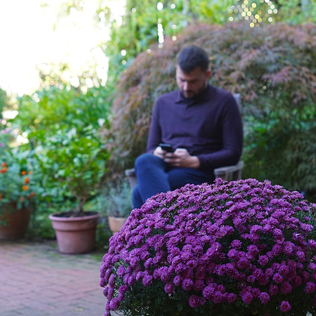
🟪 Purple: The Enigma
The Mood: Sensual, mysterious, regal, spiritual, dramatic.
The Science & Psychology: Sitting at the intersection of fiery red and cool blue, purple is a beautiful paradox—simultaneously tranquil and deeply sensual. It is an underutilized powerhouse in retail, capable of standing out on shelves with a more controlled, sophisticated presence than raw primary red.
The Market Application: Deep royal purples inherently convey majesty and prestige, instantly elevating the perceived value of a product. In its most radiant, neon intensities, purple adopts a futuristic, hyper-modern quality perfect for cutting-edge technology brands.
The Designer’s Nuance: Much like pink is to red, lavender is the gentle, sentimental derivative of purple. Moving far past its historical association with vintage cosmetics, modern lavender is a sleek, gender-neutral favourite in contemporary fashion and interior design, often associated with soothing, inviting scents and delicate culinary flavours.

⬜ The Neutrals: The Timeless Foundation
The Mood: Classic, natural, quiet, timeless, quality.
The Science & Psychology: Beige, grey, and taupe are achromatics—literally, spaces without colour—yet they speak volumes. Evoking the permanence of ancient stone monuments and desert sands, neutrals communicate durability, quiet luxury, and an unshakeable foundation.
The Market Application: If your brand narrative is built around longevity, premium craftsmanship, and timelessness, neutrals are your anchor. They ensure a product or space will never feel dated.
The Designer’s Nuance: A neutral is defined entirely by its hidden undertones. A sandy beige brings a welcoming, sun-warmed hospitality to a space, whereas a cool grey keeps a clean, collected distance. Mid-toned greys are completely non-committal, making them perfect for design studios and workspaces because they won’t compete with or distort surrounding colours. For a sleek, ultra-modern tech aesthetic, silver-greys offer a minimal, high-performance finish.
◻️ White: The Canvas
The Mood: Pure, bright, innocent, pristine, elegant.
The Science & Psychology: While white represents absolute simplicity, purity, and cleanliness, the human eye processes pure white as a brilliant, high-reflective light source. This makes it an exceptional tool for creating sharp, high-contrast boundaries in graphic design and product packaging.
The Market Application: White is the universal shorthand for hygiene, medical safety, and infant care. In product design, it serves as the ultimate marker of minimalism and structural clarity.
The Designer’s Nuance: In physical interiors, pure, stark white can feel cold and clinical. To cultivate an elegant, welcoming environment, lean into off-whites and creamy ivories. Because these warmer variations feel rich and delicious, they are highly effective in food packaging and upscale dining design.
⬛ Black: The Absolute
The Mood: Strong, classic, sophisticated, mysterious, powerful.
The Science & Psychology: Mysterious, commanding, and infinitely stylish, black holds an unparalleled position in design. The human eye and mind naturally associate black with weight, power, drama, and expensive luxury.
The Market Application: Black possesses the unique ability to elevate consumer perception; in food packaging, consumers will consistently pay a higher premium for the “gourmet image” that a black label commands. It implies longevity, substance, and high-end curation.
The Designer’s Nuance: Total black must be used with restraint, as too much of it can swallow text and dilute a visual message. However, when paired with white, it forms the most quintessential, timeless combination in history—an absolute masterclass in strength, clarity, and executive power.
Further Reading & Resources
Color: Messages and Meanings by Leatrice Eiseman (Pantone Color Institute).
Interaction of Color by Josef Albers (Yale University Press).
The Secret Lives of Color by Kassia St. Clair.
Online Publication & Educational Resource: Deep-dive studies on colour psychology and marketing at Color Matters by J.L. Morton. How colour can sway thinking, change actions, and cause reactions.
Note: Color is U.S. spelling.
Photography: Toni Seucharan Robertson